Mapped Injustice: How Geospatial Tools Are Exposing Environmental Inequity in American Communities

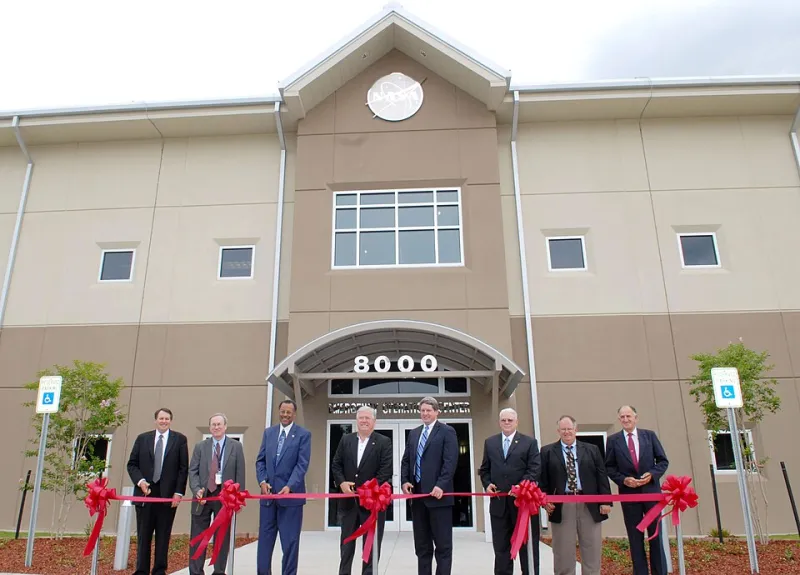
Photo: Hope Alexander, Public domain, via Wikimedia Commons
For decades, residents of communities like Cancer Alley in Louisiana or the South Side of Chicago have described their lived reality in stark, visceral terms — the chemical smell that settles at night, the diesel haze that lingers near schools, the wells that run discolored after heavy rain. What they knew intuitively, regulators and policymakers often declined to quantify. Today, geographic information systems are doing precisely that: translating lived experience into spatial evidence that is increasingly difficult to dismiss.
The intersection of geospatial technology and environmental justice has emerged as one of the more consequential applications of modern GIS practice. By layering demographic data against the locations of industrial facilities, superfund sites, traffic corridors, and air quality monitoring stations, analysts can surface patterns of disproportionate exposure that aggregate statistics routinely obscure.
What the Layers Reveal
The United States Environmental Protection Agency's EJScreen tool — one of the most widely used publicly accessible environmental justice mapping platforms — allows users to visualize environmental burden indicators alongside demographic variables at the census block level. When researchers and community organizations apply this tool to metropolitan areas, the results are frequently striking.
In Detroit, Michigan, spatial overlays have documented the dense concentration of permitted industrial facilities within a narrow band of zip codes that are simultaneously among the city's most economically distressed and most racially segregated. Similar analyses conducted in Houston's East End, in the fence-line communities surrounding petrochemical complexes along the Texas Gulf Coast, and in agricultural valleys of California's Central Valley have produced comparable findings.
The power of these visualizations lies not merely in their persuasive force, but in their precision. GIS allows analysts to calculate proximity — how many residents live within a half-mile radius of a hazardous waste site, for instance — and to correlate that proximity with health outcome data drawn from sources such as the CDC's PLACES dataset. The result is a layered argument, built from authoritative public records, that moves environmental harm from the realm of anecdote into the domain of spatial evidence.
Grassroots Movements and the Map as Instrument
Perhaps the most significant development in this space has been the democratization of GIS tools themselves. Organizations such as the Deep South Center for Environmental Justice and WE ACT for Environmental Justice in Harlem have trained community members to conduct their own spatial analyses, reducing dependence on academic institutions or government agencies to validate what residents already know.
In Richmond, California, the West County Toxics Coalition used mapping tools to document the cumulative burden of pollution sources surrounding the Chevron refinery — a facility whose 2012 fire sent thousands to local hospitals. The spatial analysis they produced became central to subsequent regulatory negotiations, demonstrating that community-generated GIS work can carry genuine policy weight.
This shift carries meaningful implications for how environmental accountability functions in practice. When affected residents can produce their own maps, they enter regulatory proceedings not as supplicants but as analysts. The data becomes a form of standing.
The Gaps That Remain
Yet for all the progress these tools represent, the spatial record of environmental harm in the United States remains deeply incomplete. Several structural limitations constrain what GIS can currently reveal.
Monitoring network density is perhaps the most consequential gap. The network of air quality monitors maintained by state and local agencies was designed decades ago, largely to satisfy federal compliance requirements rather than to capture localized exposure variation. In many urban neighborhoods, a single monitor may serve an area of several square miles — an averaging effect that can mask acute pollution events in specific blocks or corridors. Communities without monitors are, in a meaningful sense, communities without data.
Permit records and facility databases present a second category of limitation. The EPA's Toxic Release Inventory, a cornerstone of many environmental justice analyses, relies on self-reported data from regulated facilities. Facilities below certain threshold sizes may not be required to report at all, creating systematic blind spots precisely where informal and small-scale industrial activity — auto body shops, dry cleaners, small metal fabricators — tends to concentrate in lower-income neighborhoods.
Temporal resolution adds a further complication. Many spatial datasets capture a snapshot rather than a continuous record. A facility that operated for thirty years and closed before digital recordkeeping became standard may leave no spatial trace in current databases, even though its legacy contamination persists in soil and groundwater. Historical redlining maps, now georeferenced and publicly available, help contextualize this temporal gap — demonstrating that the spatial patterns of today's environmental burden are in many cases the direct inheritance of deliberate mid-twentieth-century policy decisions.
What Better Mapping Requires
Addressing these limitations will require investment at multiple levels. Expanding low-cost sensor networks — including the community air monitors now being deployed in cities like Los Angeles and Pittsburgh — can meaningfully improve spatial resolution in underserved areas. Standardizing and digitizing historical permit and remediation records would allow analysts to reconstruct environmental histories that current databases cannot capture.
There is also a data governance dimension that deserves attention. As environmental justice mapping becomes more sophisticated, questions arise about who controls the data, who has the capacity to interpret it, and whose analytical frameworks are treated as authoritative. GIS professionals working in this space have an obligation to engage those questions with the same rigor they apply to their technical methods.
The maps being drawn today are more detailed, more accessible, and more consequential than anything available to previous generations of environmental advocates. They are also, by any honest accounting, still incomplete. Closing the remaining gaps is not merely a technical challenge — it is a matter of whose environment, and whose health, we are ultimately willing to count.